
.png)

Project Overview
Client: Victoria Flooring
Industry: Flooring Products
Location: Kent, UK
Overview
Victoria Flooring, a leading provider of high-quality flooring solutions in Kent, teamed up with Truene Creative to give their digital presence a much-needed makeover. Our mission: modernise their website, solidify their brand identity, and roll out the red carpet (or laminate) for more foot traffic to their store. The result? A swanky, user-friendly website that not only looks the part but also acts as a conversion powerhouse.
WHAT'S THE END-GAME?
Project Objectives
Our mission was clear: Reinforce Victoria Flooring’s website to increase in-store visits, enhance the user experience, implement sharp calls-to-action (CTAs), and showcase their products like never before. We aimed to craft a design that mirrors Victoria Flooring’s brand values and expertise, luring online visitors into the physical store.
The plan also included a streamlined, intuitive interface that guides users while strategically positioned CTAs drive engagement and conversions. Lastly, we wanted to present flooring options in a visually appealing, organised manner.
LIKE CLASSIC HARDWOOD, STURDY BUT READY FOR A POLISH
Challenges Faced by Victoria Flooring
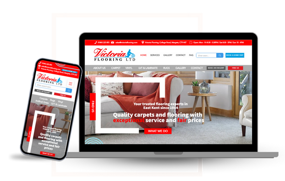
Victoria Flooring’s old website was like a trusty pair of old socks—comfortable but in need of a stylish upgrade to keep up with the times. While it served its purpose, it became clear that a more modern, streamlined approach could significantly enhance user experience and engagement. The homepage featured a slider that wasn’t engaging users as effectively as it could have. Important information such as contact details and the store address was not as prominent as it needed to be, making it harder for visitors to find essential information quickly.
The product pages were informative but could be more user-friendly, requiring multiple clicks to view detailed product options. The previous rugs landing page operated as an e-commerce platform, which was not aligned with the client’s new focus on driving in-store visits for a more personalised experience. Overall, the site had great potential but needed a refresh to better align with Victoria Flooring’s goals.
What does research show about sliding banners?
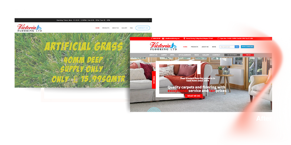
Research indicates that sliders, or carousels, can be distracting and often ineffective. Studies have shown that users typically do not wait for slides to rotate, as they prefer to scroll directly to the information they need. Sliders can also slow down page load times, which can negatively impact user experience and SEO rankings. By removing the slider, we focused on delivering a straightforward, user-friendly experience that reduces clutter and enhances engagement.
When you have a large inventory, how should products be displayed?
Why does cohesive branding matter?
SO, WHAT DID WE DO?
Design & Development Strategy
For consistent branding, we employed Victoria Flooring’s logo colours and introduced a floor plan/tile design motif that recurs throughout the site, reinforcing their industry-specific identity. A distinctive design feature resembling a floor plan or tile frames key messages and imagery, ensuring thematic consistency and visual appeal. On the homepage, we adopted a no-slider approach. Research indicates that sliders can be distracting and ineffective, so we replaced the slider with a clean-cut, streamlined homepage that delivers clear and direct information. Contact details and the store address were prominently placed in the header, ensuring visitors can easily find essential information.

To ensure effective CTAs, we strategically positioned them to guide users towards actions such as scheduling home visits, visiting the store, or contacting the business. Each CTA was designed to be visually distinct and compelling, effectively prompting user interaction.
Enhanced User Experience
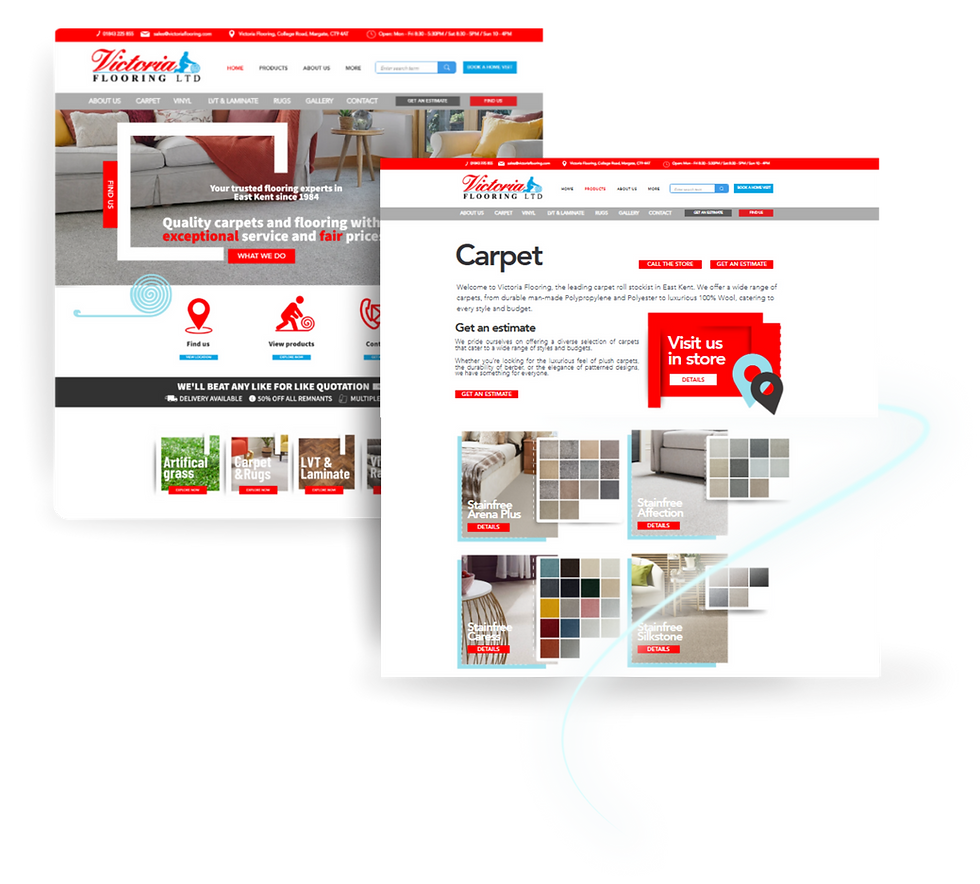
The carpet landing page showcases all carpet colours and styles for each brand with lifestyle photography and adjacent static tiles. This comprehensive display allows users to quickly view all available styles under each brand without unnecessary navigation steps. The page includes a top-positioned CTA for store visits and estimate requests, a ‘Why Us’ section, and a contact form to facilitate user engagement.
For the vinyl, LVT, and laminate product pages, we ensured thematic alignment by framing product images with a blue border, maintaining visual coherence with the homepage. Photography showcases the vinyl flooring in various settings, providing users with a realistic view of product applications. Each page features top-positioned CTAs, a map link for store visits, an estimate request button, a ‘Why Us’ section, and a contact form to enhance user engagement.
The rugs landing page transitioned from an e-commerce platform to an image-focused, service-based approach to drive in-store visits. The updated design aligns with the website’s overall theme, featuring immediate CTAs encouraging store visits and estimate requests.
Additional Enhancements
The contact page was updated to include dark grey arrows for intuitive guidance, a themed contact form, an embedded Google map, and comprehensive contact details. These elements ensure users can easily find and connect with Victoria Flooring. The About Us page introduced a timeline feature outlining key milestones in Victoria Flooring’s history, with strategic CTAs to encourage user engagement. The FAQ page was enhanced with a modern tab feature to categorise service-related and home support queries, improving the browsing experience on both mobile and desktop devices.

SO, DID IT ACHIEVE THE GOALS?
Results & Impact
Absolutely it did. The redesigned website for Victoria Flooring is now a robust marketing tool aligned with their business goals. The site’s user-centric design, cohesive branding, and strategic CTAs have enhanced user experience and engagement. The clear, engaging CTAs guide visitors towards actionable steps, driving more in-store visits and increasing sales potential. This comprehensive redesign has positioned Victoria Flooring for sustained growth and customer acquisition.
By focusing on usability, aesthetic consistency, and clear business objectives, we have provided Victoria Flooring with a powerful online presence that effectively supports their growth and customer engagement goals.
Need more details or just itching to chat about how we can turbo-boost your next project? We're here and ready to catapult your digital game to the stars. At Truene Creative, we don’t just design; we dive into the trenches with you, making sure your goals become our goals.